Adopting Liquid Glass, Part III (NetNewsWire iOS)

A look at Liquid Glass changes coming to NetNewsWire on iPad and iPhone.

NetNewsWire has an experimental branch with work-in-progress Liquid Glass changes. These changes cover the Mac, iPad, and iPhone apps. This post covers changes to the iPad and iPhone app.
iPad
Sidebar
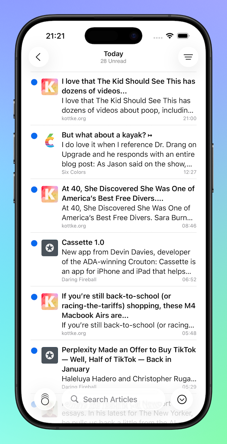
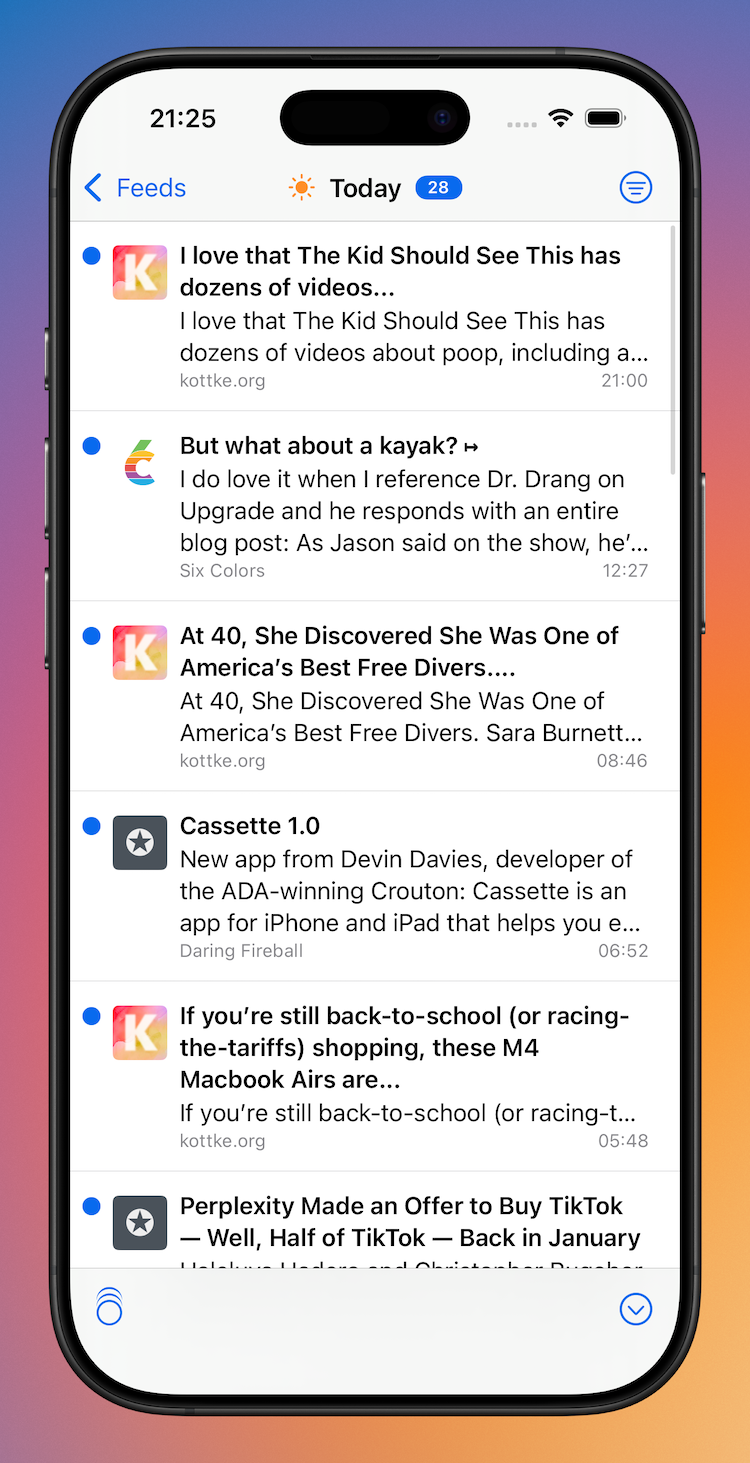
The Sidebar (Feeds view) has had a significant refresh.
What was previously a UITableView is now a UICollectionView. While this gives more flexibility in terms of custom layout, it was a change that was needed in order to adopt modern styling across iPad and iPhone. iPad uses the .sidebar style, and iPhone uses .insetGrouped. This is similar the behaviour you see in Mail.
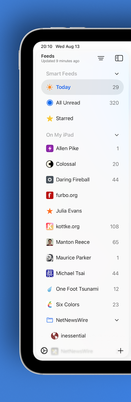
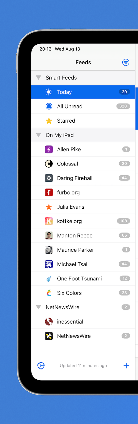
Modern Sidebar (left), Classic Sidebar (right)
From top-to-bottom, the following modernising changes have been made:
- The current refresh status is now located in the navigation bar as a subtitle, having previously been the footer
- Toolbar buttons follow Liquid Glass standards
- Like the Mac refresh, the Feeds view floats and allows Timeline content to slide underneath
- Smart Feeds and Account headers now adopt modern secondary styling
- Selected feeds have a modern capsule background and the text is bold (note: there is little consistency in Apple's apps—Files makes text bold while Reminders doesn't)
- Folders have been entirely redesigned to match modern standards—they now have the same indentation as any other feed, but the enclosed feeds are indented further
- Folders will highlight when Feeds are being dragged and dropped into them
- Separators have been removed
- Unread counts are larger and are no longer backed by a filled capsule
- Unread counts for folders are only displayed when the folder is closed
- Swipe actions reveal icons instead of named labels due to space constraints
- Users can resize the sidebar (within reason 😃)
When side-by-side, you can see that there are less feeds on screen as the modern cells have larger vertical margins.
Timeline
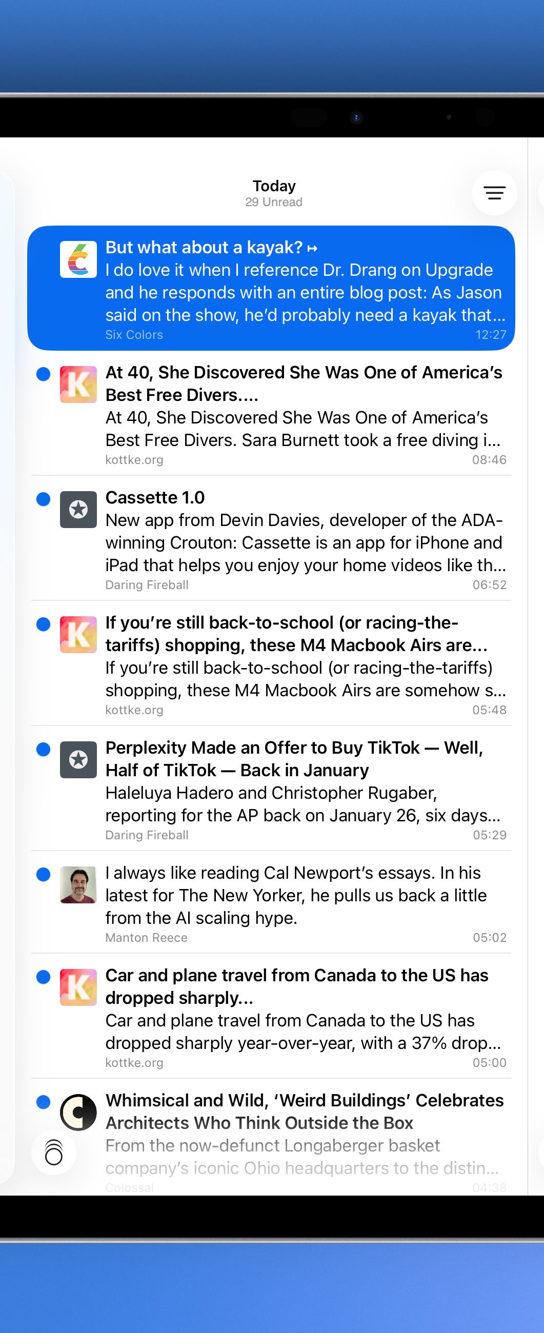
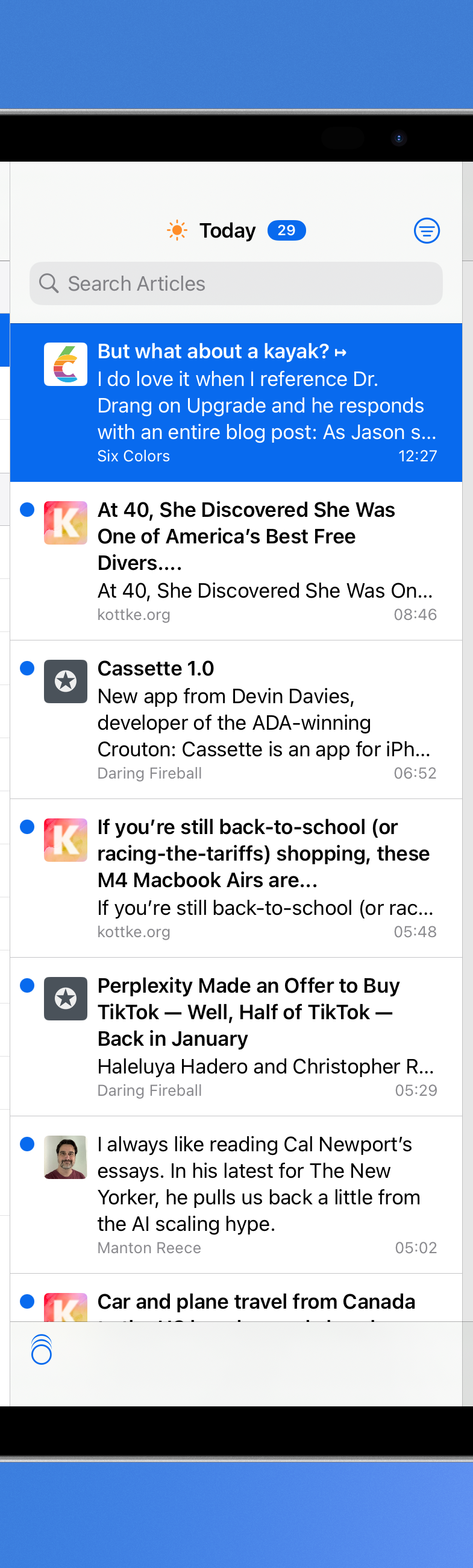
Modern Timeline (left), Classic Timeline (right)
Again, from top-to-bottom:
- Navigation bar images have been removed
- Unread counts are now located in the navigation bar subtitle
- The search bar has been moved to the app-wide toolbar and behaves similar to the Mac search
- The Timeline width is user adjustable (again, within reason 😄)
- Timeline cells have been redesigned in Interface builder and now have the rounded corner selection style
- The Mark All as Read image (on both iPad and iPhone) has had alignment changes to make sure it sits in the middle of an englassified button
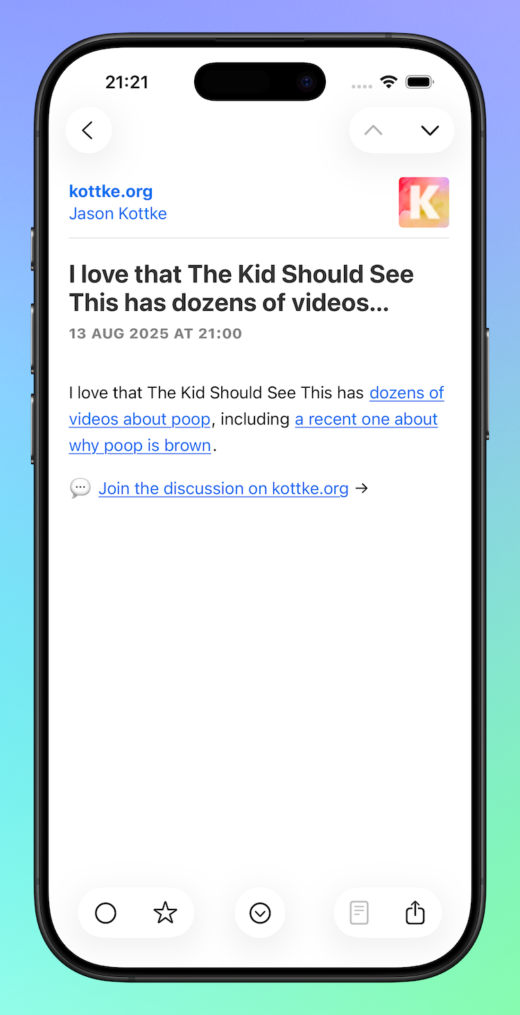
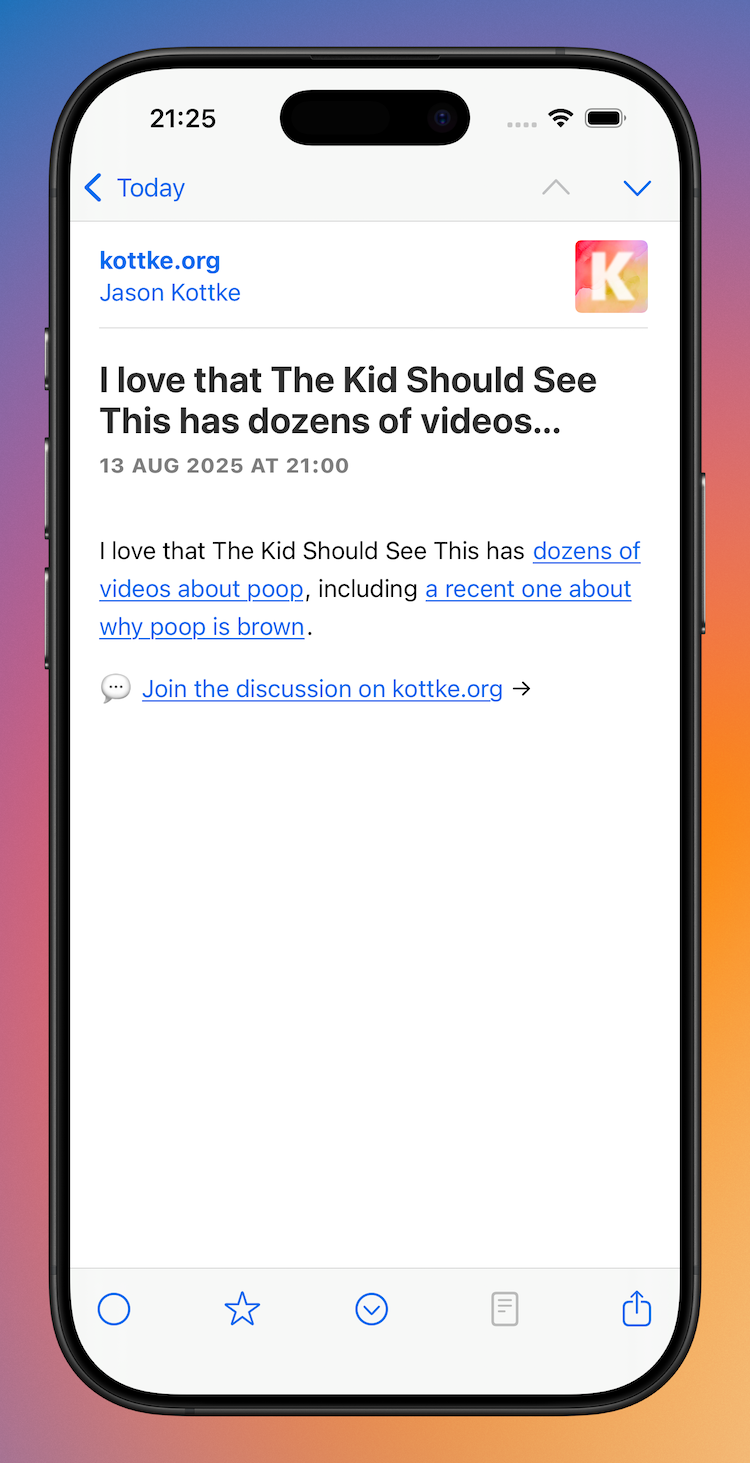
Articles
Modern Article (left), Classic Article (right)
There aren't many changes to the Article view:
- Articles can be read in three-pane view without hiding the Sidebar
- The top toolbar inherits search capabilities
- The bottom toolbar buttons have been grouped in a 2-1-2 formation with the Next Unread button sitting in the throne seat
iPhone
Sidebar
Similar to the iPad, the iPhone Feeds view has had a significant lick of paint.
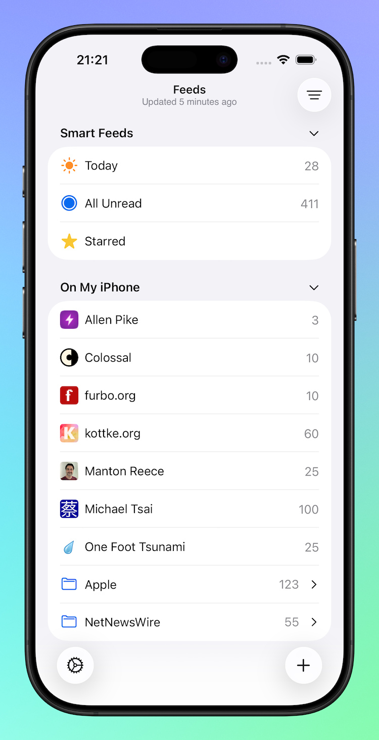
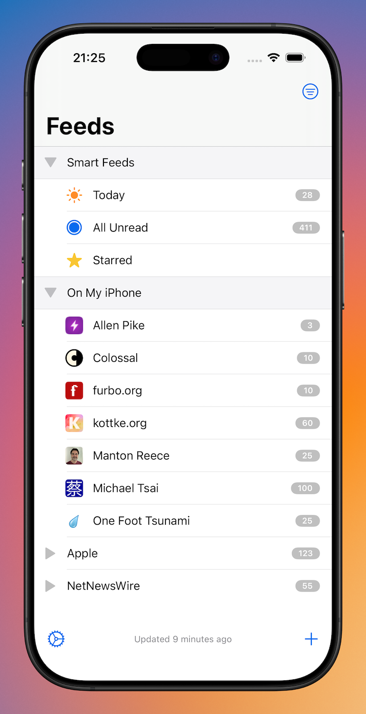
Modern Feeds (left), Classic Feeds (right)
As mentioned above, the overall design adopts an .insetGrouped style. Comparatively:
- Inline navigation titles are used
- The latest refresh status has moved to the navigation bar subtitle from the bottom toolbar
- Smart Feeds and Account headers now adopt modern styling
- Disclosure indicators have moved from left to right
- Similar to the iPad updates:
- Folders will highlight when Feeds are being dragged and dropped into them
- Unread counts are larger and are no longer backed by a filled capsule
- Unread counts for folders are only displayed when the folder is closed
- Swipe actions reveal icons instead of named labels due to space constraints
Timeline
Modern Timeline (left), Classic Timeline (right)
Timeline changes on the iPhone are slightly different to those of the iPad:
- The navigation bar makes use of the subtitle to display either the current unread count or, if the unread count is zero, the latest refresh time
- Images and capsule-backed unread counts have been removes from the navigation bar
- The search bar has been moved to the bottom of the screen and is no longer hidden under the navigation bar
- Cells have modern rounded corner selection style
Articles
Modern Article (left); Classic Article (right)
There are almost no changes to the iPhone's Article view other than adopting modern bar and button styling. Phew!
Discussion