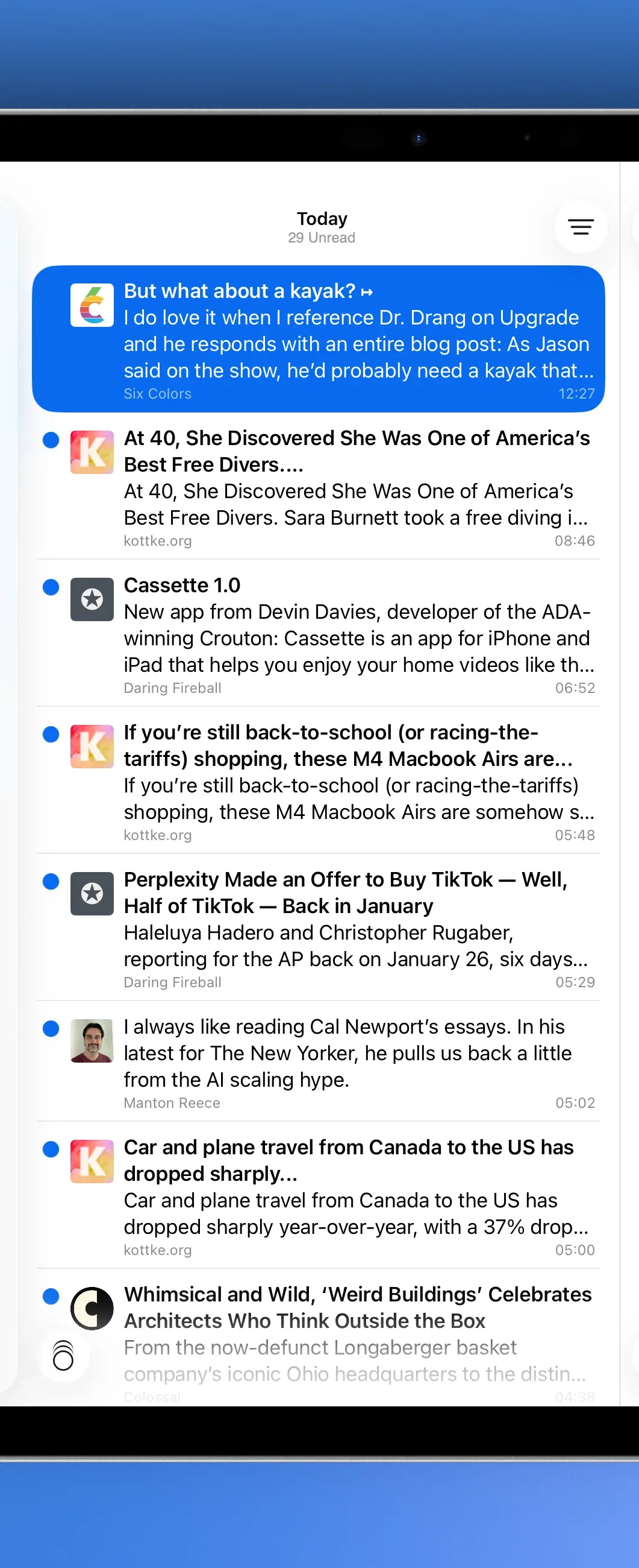
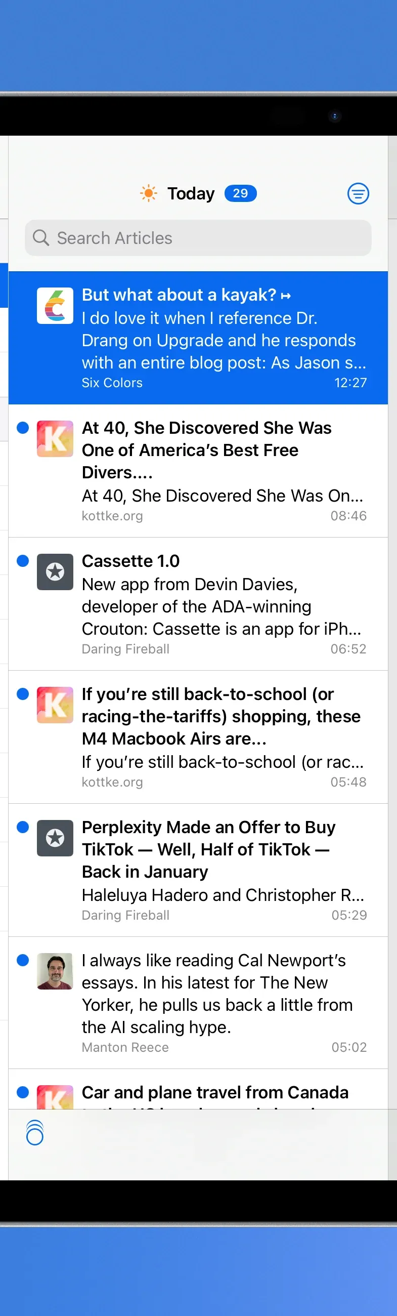
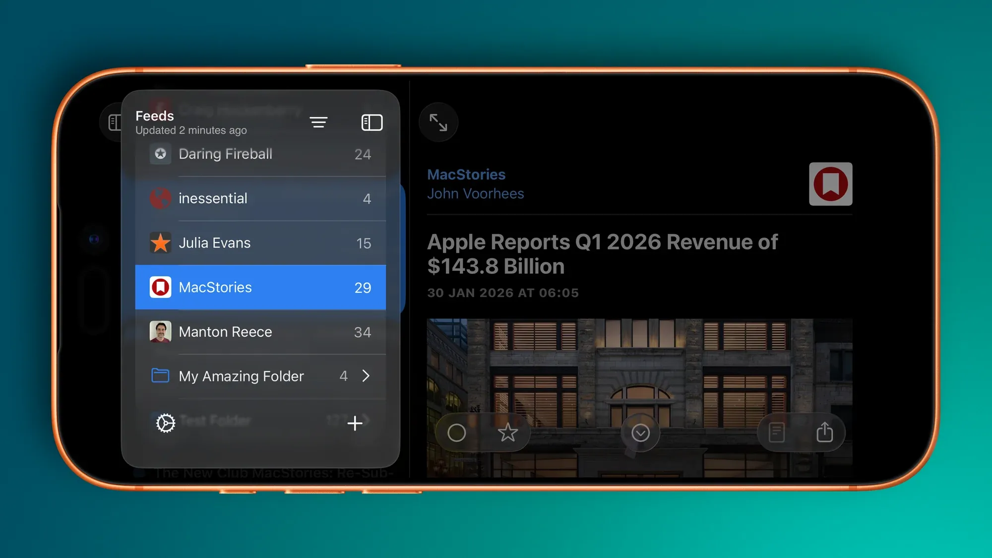
Matrix for NetNewsWire
0:00
/0:02
Matrix
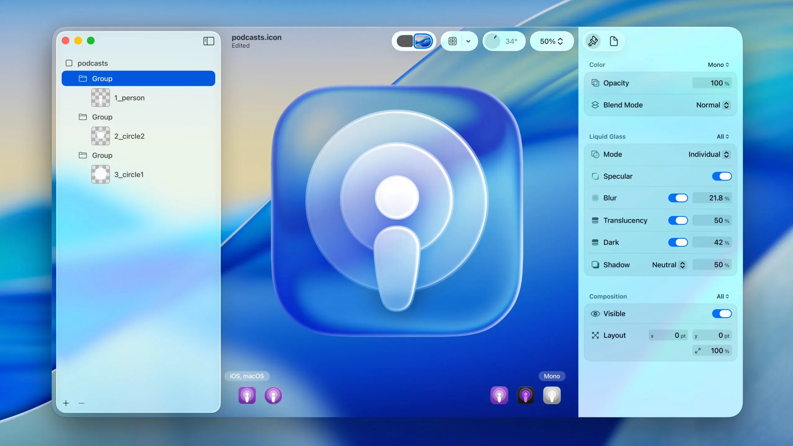
This theme is *Matrix-*inspired and was built with the help of Claude (there’s simply no way my CSS is this clean and tidy). This theme shines when your device is in dark mode.
Features
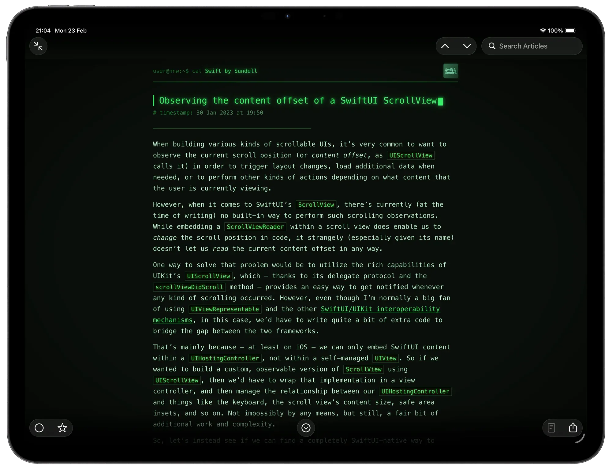
Visual Style
- Phosphor-green palette — deep near-black background with glowing green text
- CRT vignette — a radial gradient overlay darkens the screen edges for a vintage monitor feel (macOS only)
- Boot flicker — the page and article animate in with a CRT power-on flicker effect
- Monospace throughout — SF Mono
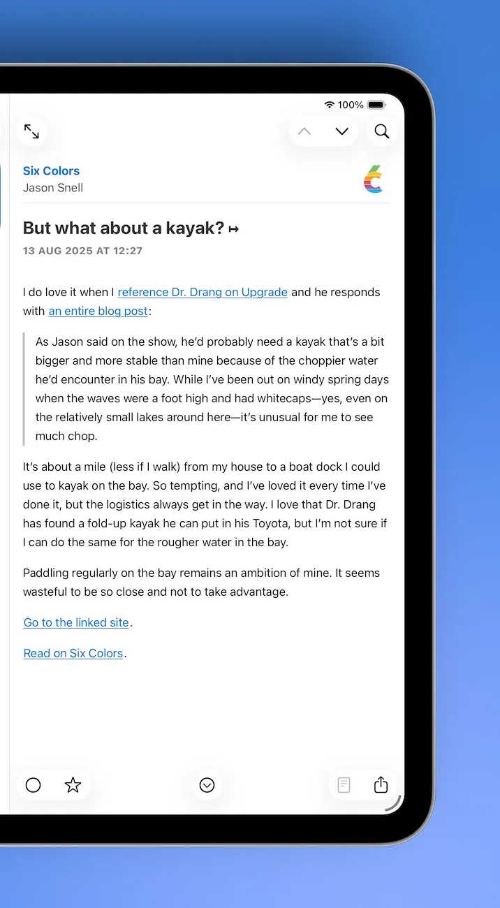
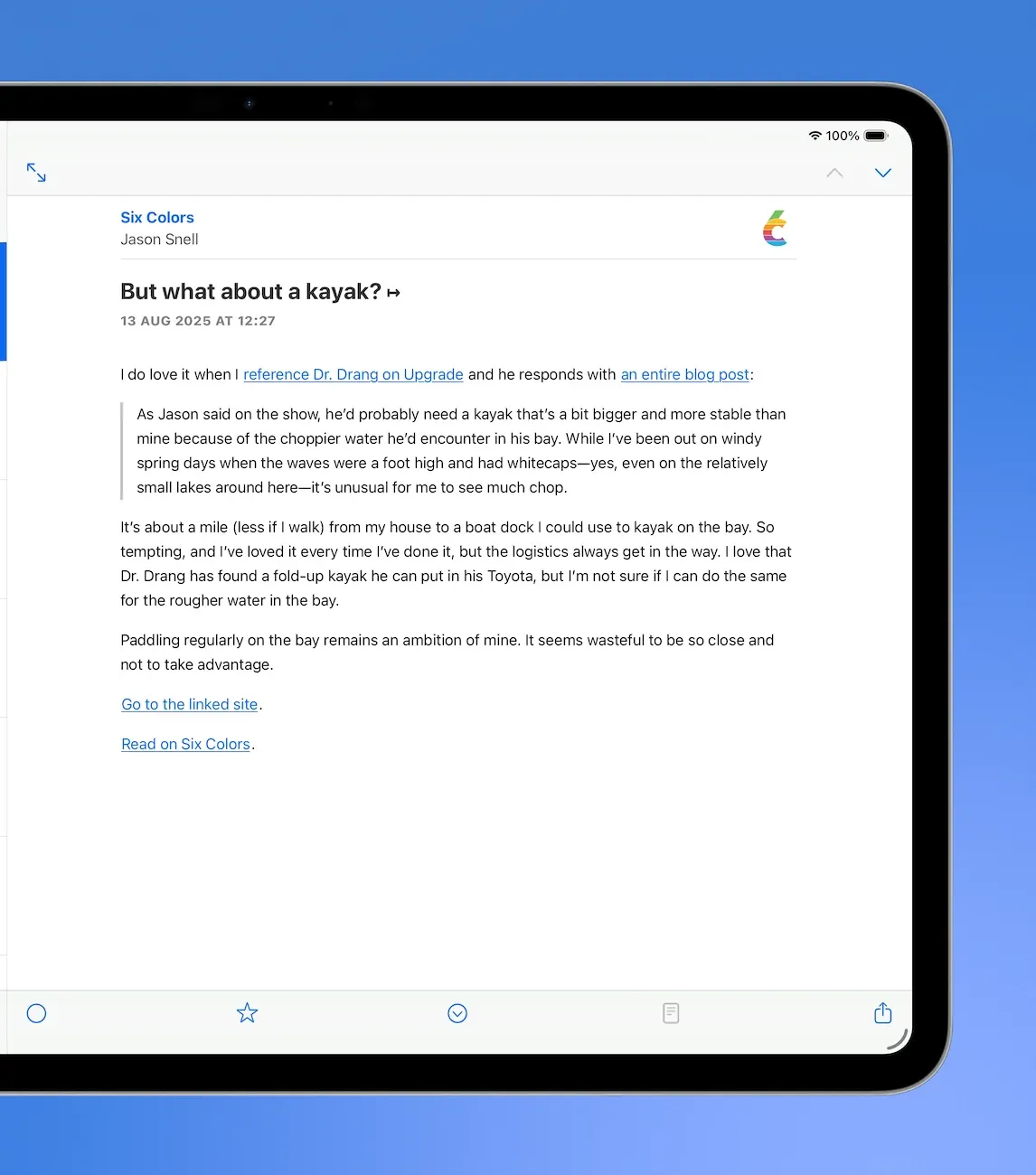
Article Header
- Feed name is prefixed with a shell prompt:
user@nnw:~$ cat - Publish date is prefixed with
# timestamp: - External link is prefixed with
# source: - Feed icon is rendered in greyscale with a green tint and a pixel-art rendering mode
Article Title
- Typewriter animation — the title types out character by character in reading order, correctly handling titles that span multiple lines
- Blinking block cursor (
█) appears after the last character lands and blinks indefinitely
Article Body
- Separator line of
─characters between the header and body - Headings prefixed with Markdown-style
##,###,####markers - Blockquotes styled with a left border and faint green background
- Code blocks include a fake terminal title bar (
● ● ● output) and horizontal scroll on overflow - Inline code highlighted in amber with a subtle glow
- Tables use uppercase headers, row hover highlights, and a green glow on the border
- Figcaptions prefixed with
// - Images are desaturated and dimmed; hovering partially restores colour
Platform Behaviour
- iOS — uses dynamic type sizing, system hyphenation, and respects safe area insets;
htmlbackground is set so native navigation and tab bar blur effects sample the correct dark colour - macOS — includes the CRT vignette, wider padding, and fixed text-size classes (
smallText→xxlargeText)
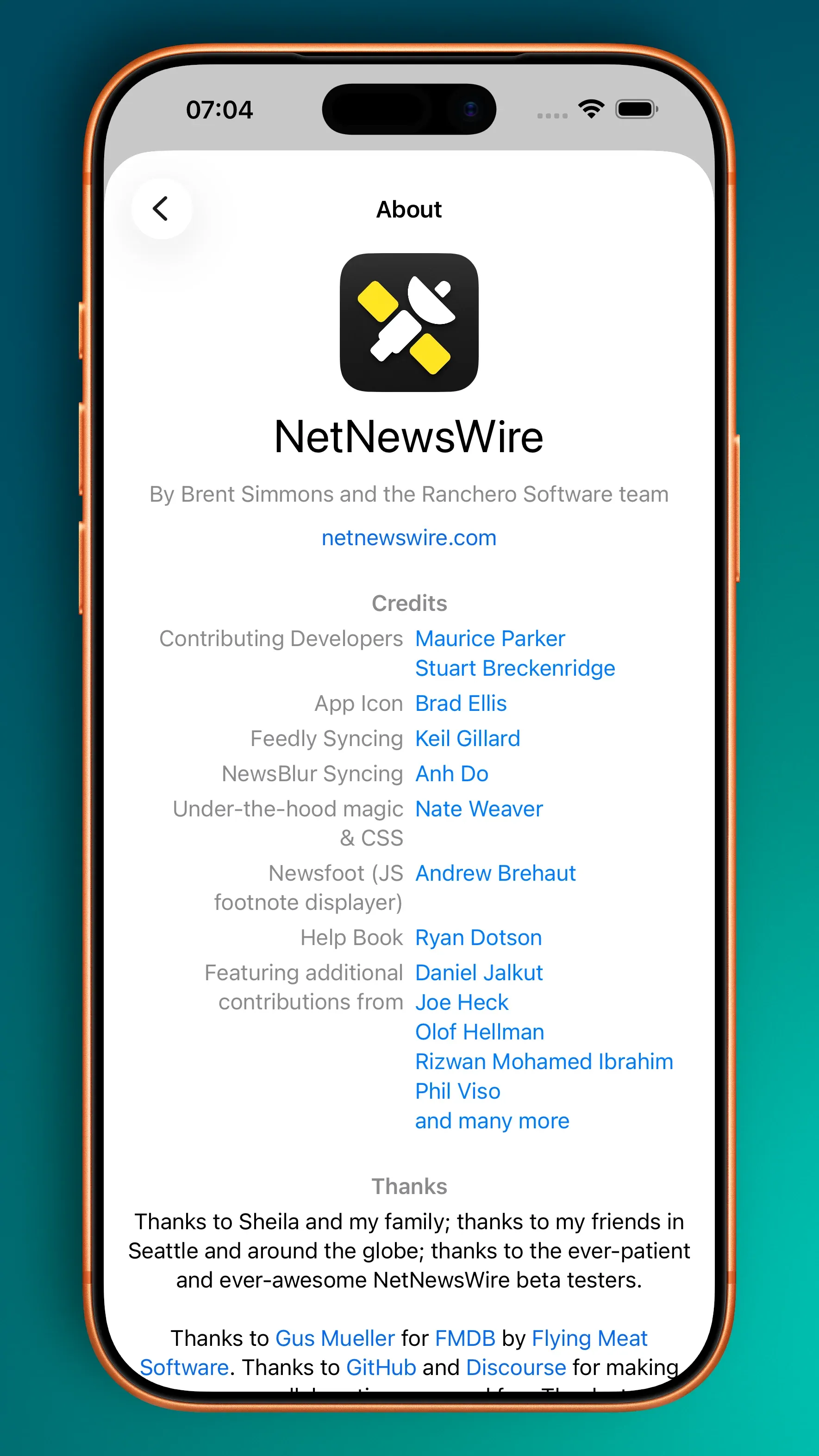 The new About view.
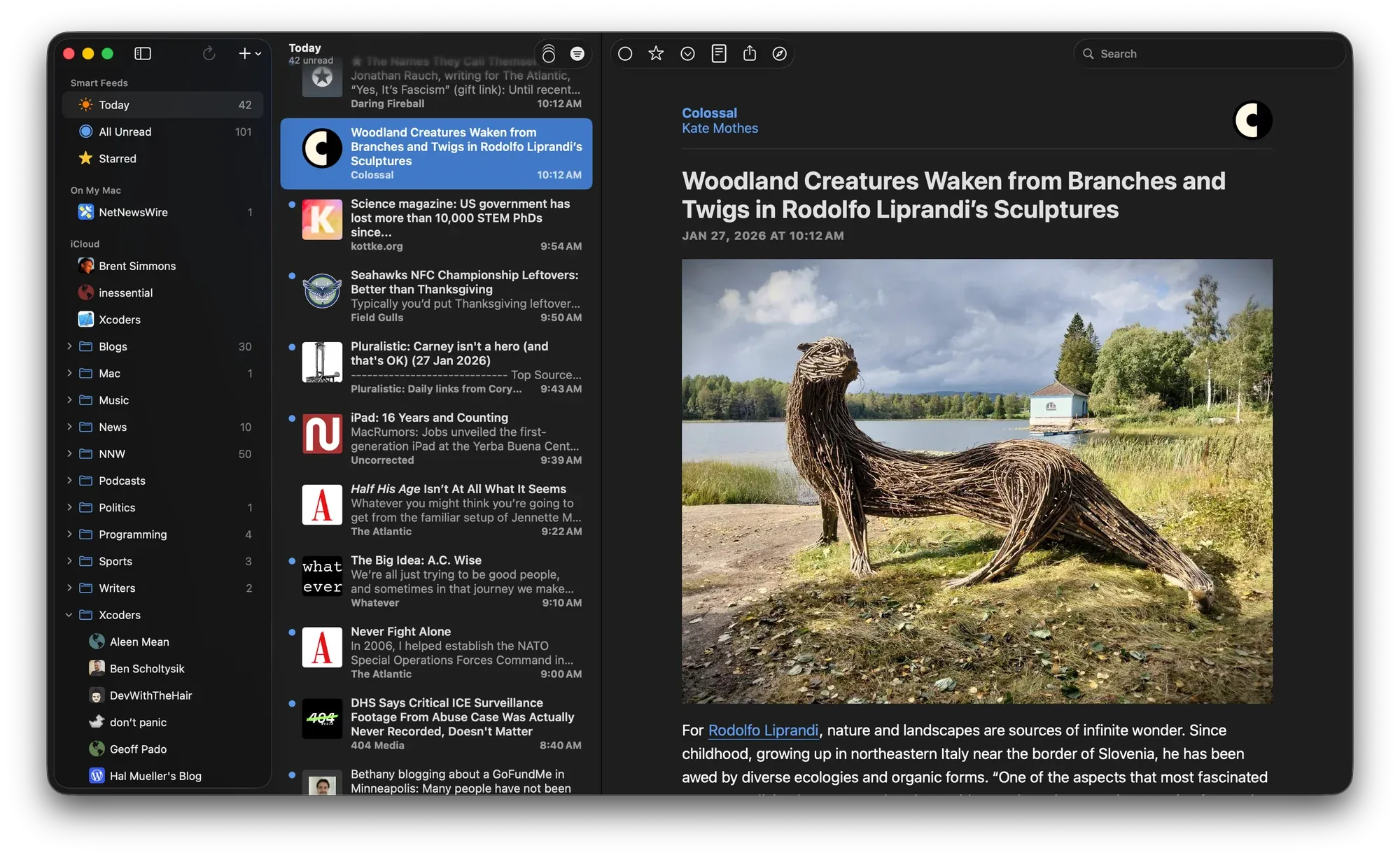
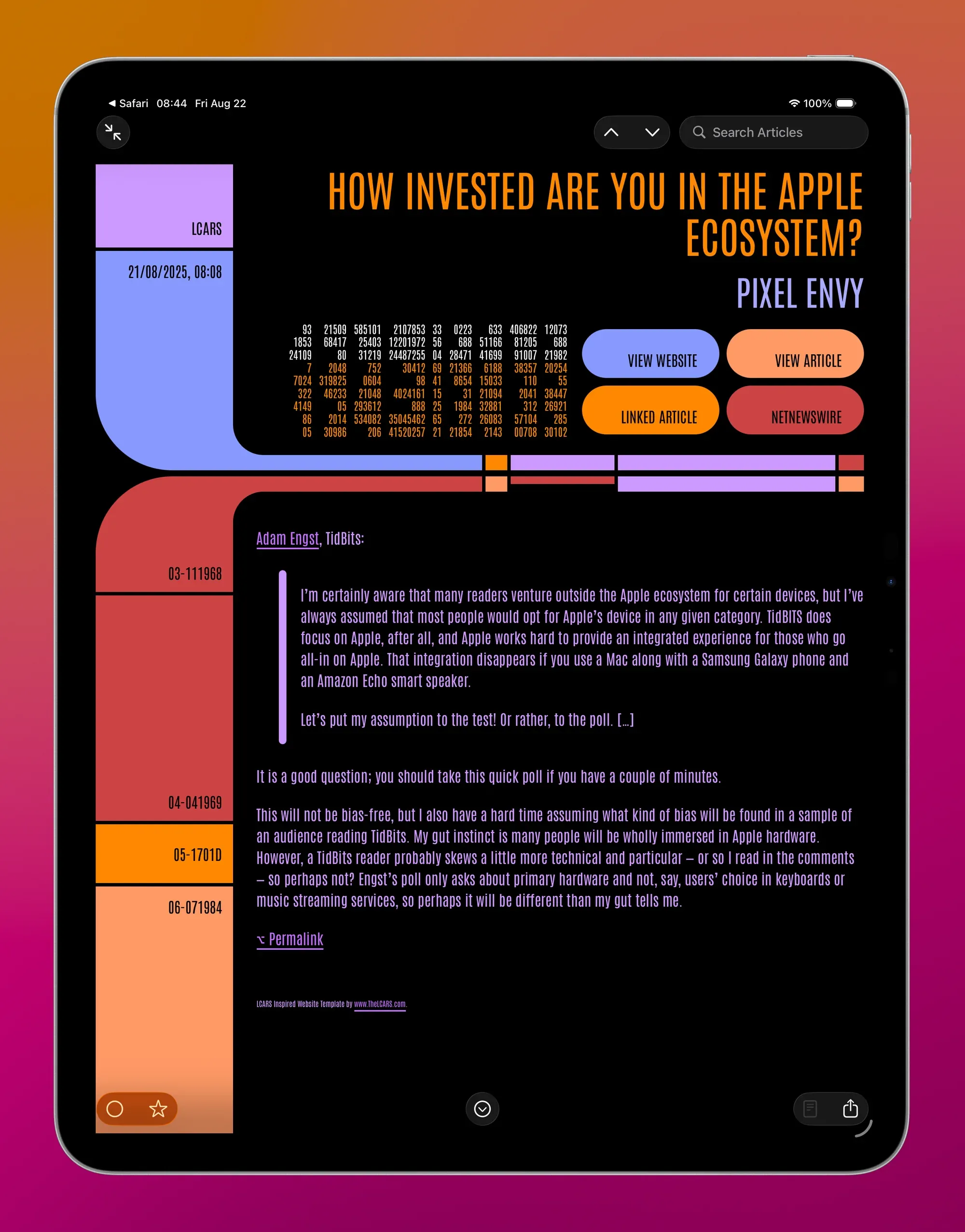
 A PADD with LCARS