Adopting Liquid Glass, Part V (Singapore Buses, Finishing Touches)
Maps, Search, toolbars and tab bars were covered in Adopting Liquid Glass, Part I (Singapore Buses) and Adopting Liquid Glass, Part IV (Singapore Buses, Revisiting the Tab Bar). Arrivals, Routes, Advertising, and Settings are the last four areas that have seen some tweaks.
Arrivals
Overall, the Arrivals view has seen very little in the way of change.
The Favourite and Arrival Notification buttons have a slightly different tinting behaviour when selected, while the Live Activity bolt button now presents a popover menu to the user. Tips, via TipKit, have also been added to explain what these buttons do when selected.
Tips via TipKit
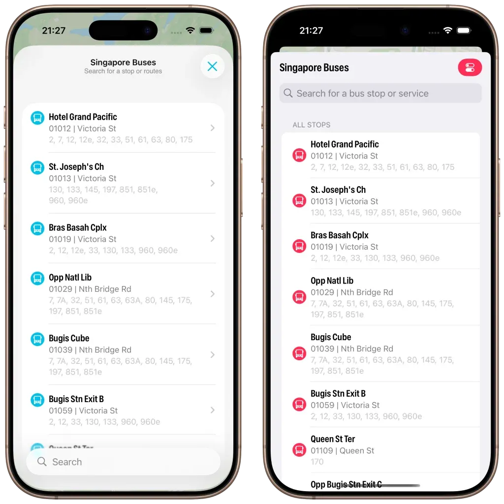
Routes
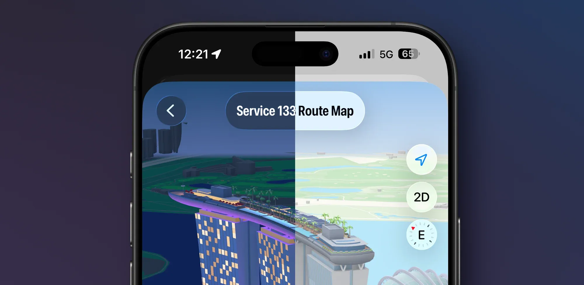
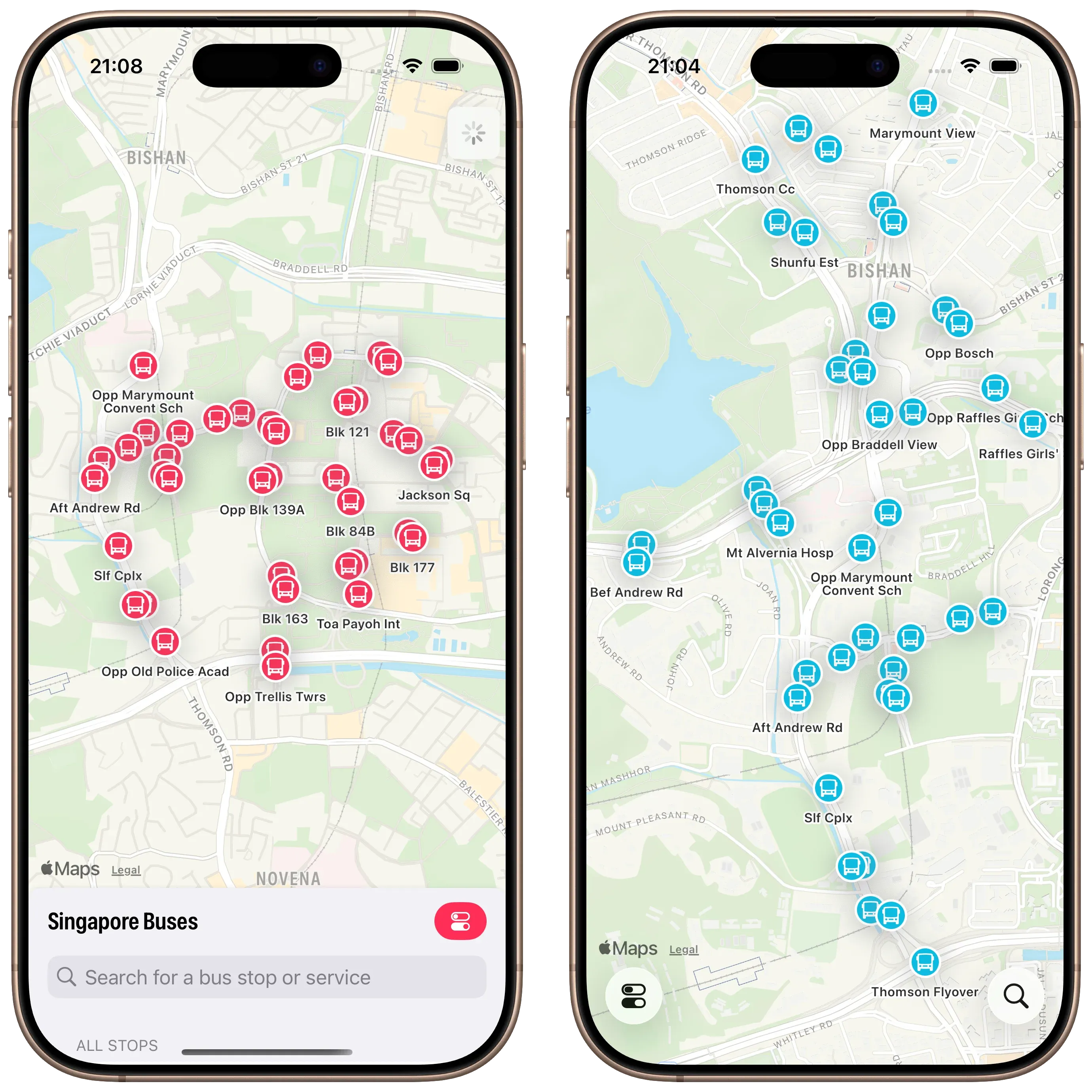
The Routes view maintains consistency with previous releases. However, the Route Map has been given some additional flexibility—ability to view in 3D, panning, rotating and zooming—so that it can take advantage of the Apple Maps ‘Detailed City Experience’. It’s also using glassified titles.
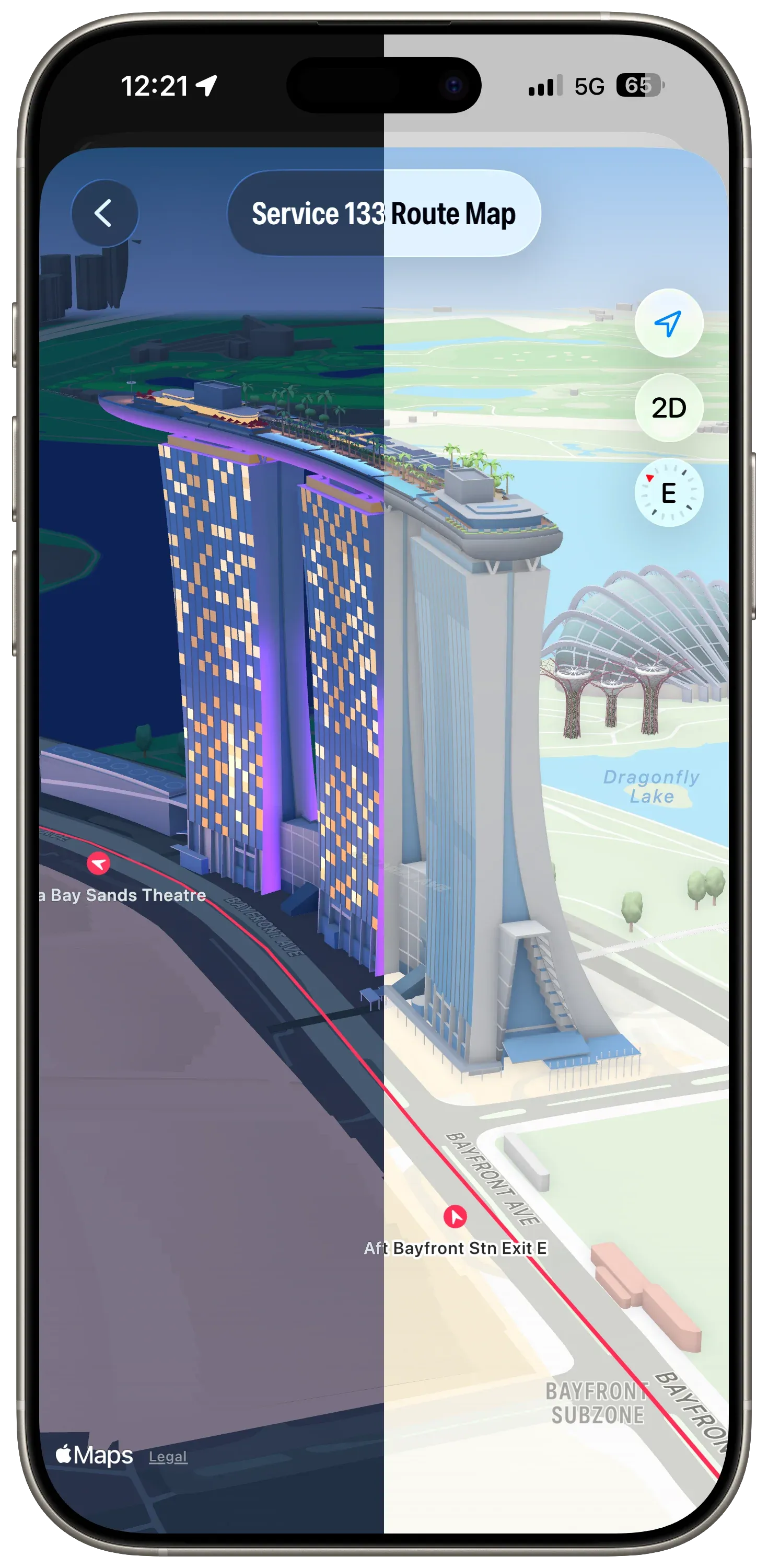 Routes at Marina Bay Sands. Dark mode, light mode.
When the map is rotated, the bus stop annotations rotate in real time so they always point to the next stop on the route.
Advertising
I was playing with different ad placement and styles just before this Mastodon post was made. In the Singapore Buses’ App Store build ads can appear in a few places—at the top of, between, or at the bottom of List sections, or at the bottom of the map.
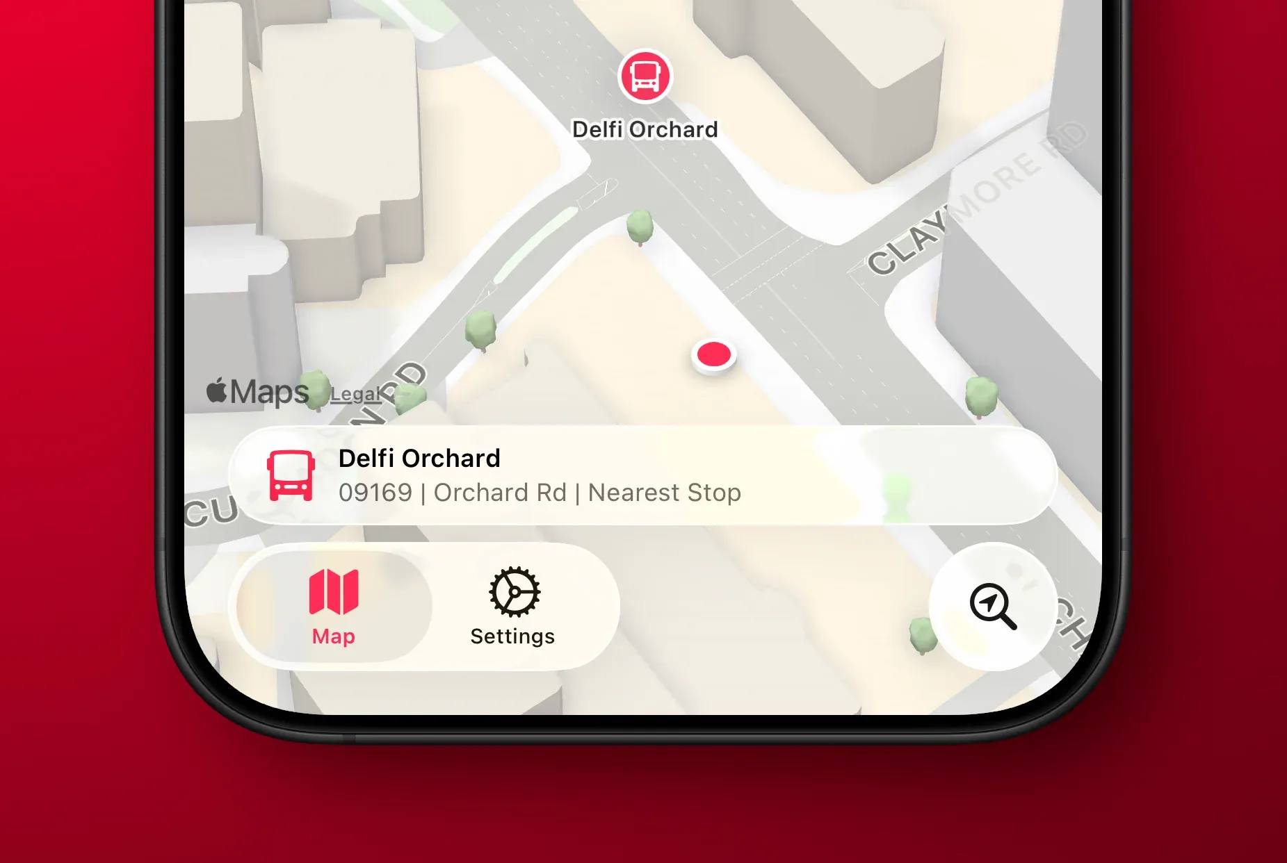
In the Liquid Glass update, I’ve settled on ads having a consistent placement in the bottom safe area—across Arrivals, Search, and the Route Map. And, staying on brand, they’ve also been Liquid Glassed.
Liquid Glass Advertising on top of the Map
Settings
Settings has some new features: more theme colours, a new acknowledgment view, and a new explainer view for Arrivals. However, there’s nothing new that’s specific to Liquid Glass (thankfully).
What’s Next?
As the work on this update comes to a close, my attention is now on the App Store. New App Store videos, screenshots, app description, and release notes. In addition to all the Liquid Glass changes, there’s a host of other changes that have been made as well. For example, GRDB has replaced Core Data…and the app now runs natively on the iPad. 🤯
A TestFlight build is coming soon.
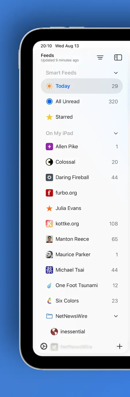
 NetNewsWire Toolbar
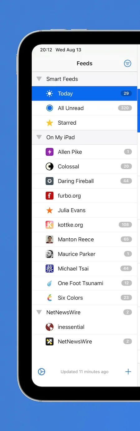
 Modern vs Legacy
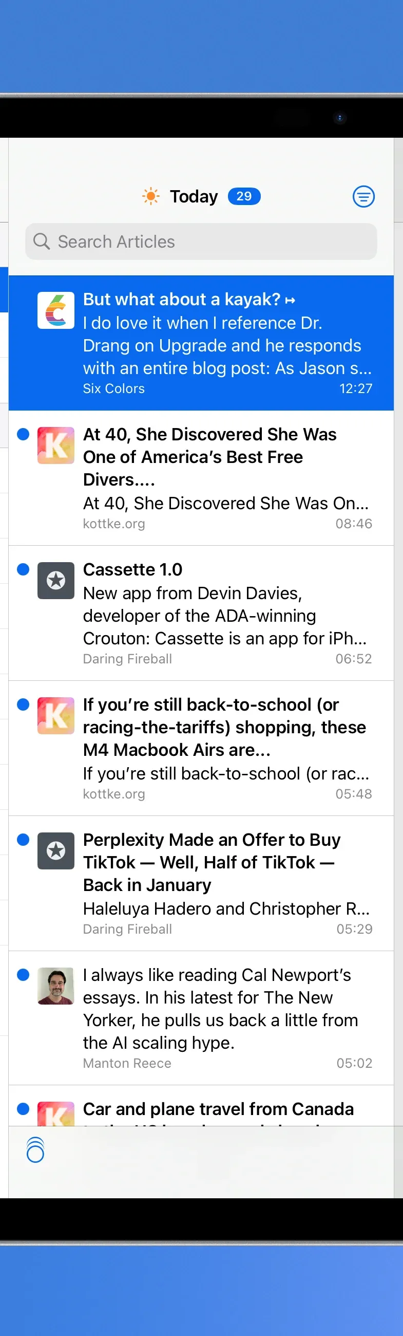
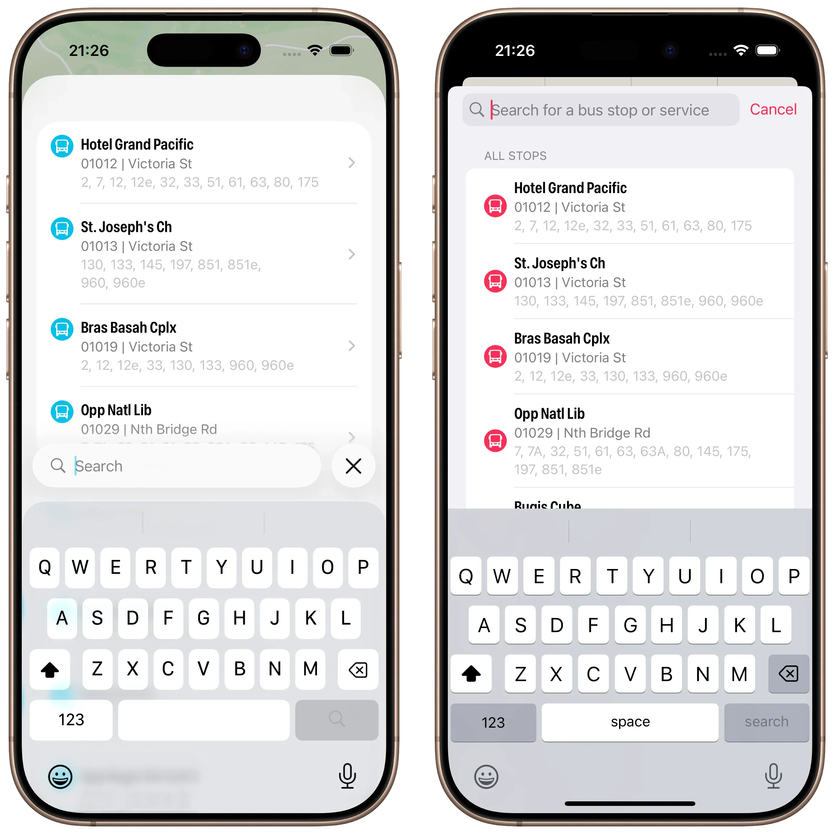 Search with Active Keyboard