Adopting Liquid Glass, Part IV (Singapore Buses, Revisiting the Tab Bar)
The Tab Bar Strikes Back.

In my first article in this series, Adopting Liquid Glass, Part I (Singapore Buses), I ran into a critical bug that made it problematic to adopt the new Tab Bar design:
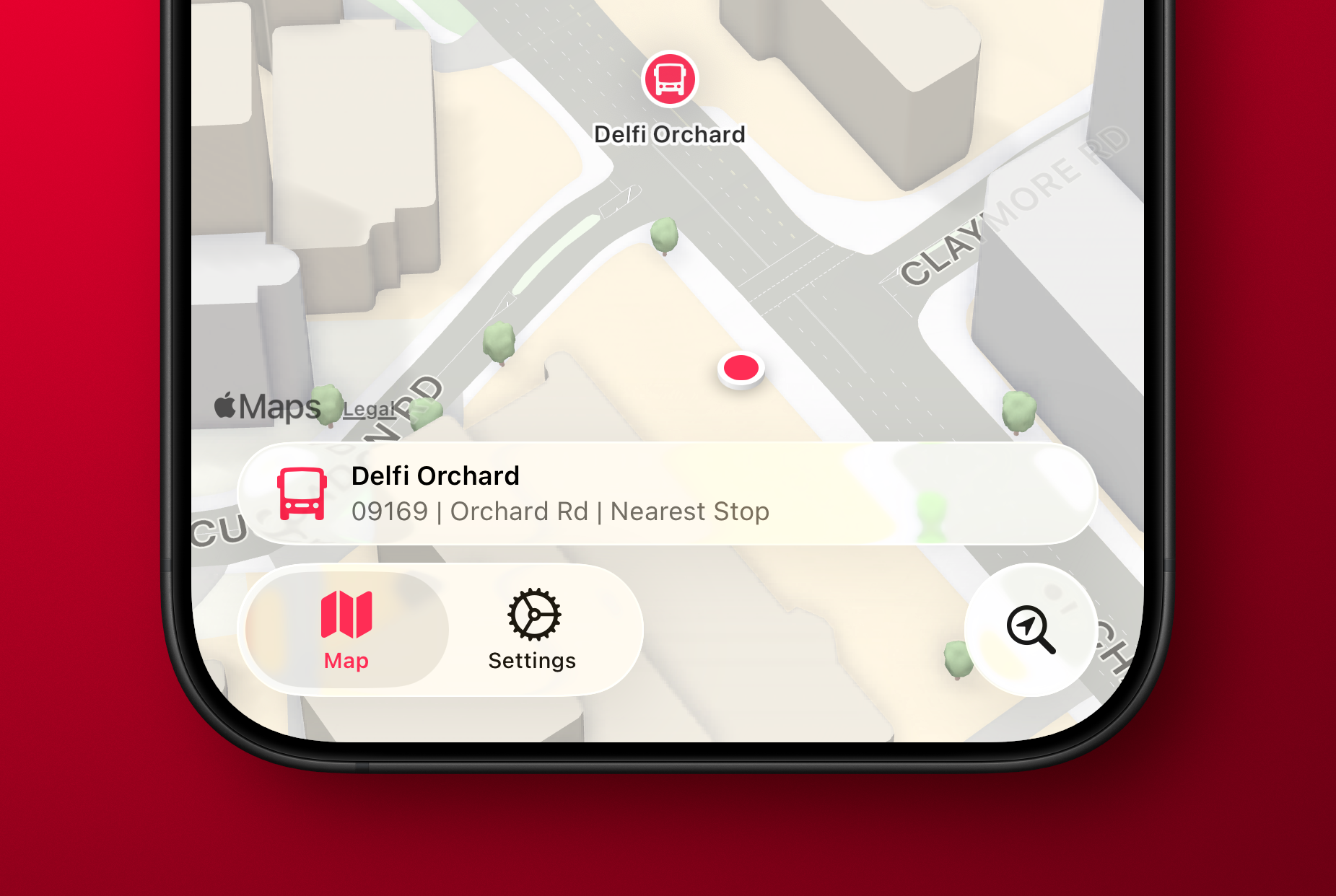
On my Map tab I was using atabViewBottomAccessoryto show the nearest bus stop to the user—to give them an easy way to tap and show arrival information. However, the accessory was available across all tabs where it made no sense (like Settings). Trying to hide the accessory (usingEmptyView) when the selected tab wasn’t the map worked, but navigating back to the map caused the map to stop extending into the safe area, resulting in a lovely white bar along the top.
Luckily, this bug has been fixed in the recent betas so I've revisited my original design and the outcomes are positive.
Tab Bar Bottom Accessory Visibility
From a usability perspective, it only makes sense to display the accessory when two conditions are met:
- The map tab is displayed; and,
- The user has given permission to track location
The simplified code below shows how this is achieved when tracking the tab bar selection:
enum Tabs: Equatable, Hashable {
    case maps
    case settings
    case search
}

@main
struct sgbusesApp: App {

    // MARK: State
    @State private var selectedTabIndex: Tabs = .maps


    var body: some Scene {
        WindowGroup {
            TabView(selection: $selectedTabIndex) {
                Tab("label.title.map", systemImage: "map", value: .maps) {
                    BusStopMapView()
                }

                Tab("label.title.settings", systemImage: "gear", value: .settings) {
                    SettingsView()
                }

                Tab("label.title.search", systemImage: "location.magnifyingglass", value: .search, role: .search) {
                    BusStopListView()
                }
            }
            .tabViewBottomAccessory {
                if selectedTabIndex == .maps {
                    HStack {
                        Image(systemName: "bus.fill")
                            .font(.body)
                        VStack(alignment: .leading) {
                            Text(verbatim: database.allStops.first!.busStopDescription)
                                .font(.caption)
                                .bold()
                            Text(verbatim: (database.allStops.first!.busStopCode) + " | " + (database.allStops.first!.roadName) + " | " + "Nearest Stop")
                                .font(.caption)
                                .foregroundStyle(.secondary)
                        }
                        Spacer()
                    }
                    .padding(.vertical, 4)
                    .padding(.horizontal)
                    .contentShape(Rectangle())
                    .onTapGesture {
                        // show bus arrivals
                    }
                } else {
                    EmptyView()
                }
            }
        }
}
Ensuring Legibility
One of the main concerns with Liquid Glass is legibility. This is even more a of concern when using a tab bar bottom accessory as there is now text where there wasn't any in my previous toolbar-based design.
To keep things legible, Singapore Buses uses a muted map style. This provides a reasonable balance: the glass effect remains fun to look at without becoming a distraction, even when the map is busy with content.
The 'Detailed City Experience' is so, well, detailed!
Assuming the tab bar doesn't undergo some wild design changes between now and the iOS 26 release candidate, my intention is to ship the next version of Singapore Buses with a tab bar.
The next (and final) article in this series will look at the remaining views: Arrivals, Routes, and Settings. I'll post that closer to release.
Discussion