Adopting Liquid Glass, Part I (Singapore Buses)

Toolbars, Tab Bars, and Search

Adopting Toolbars
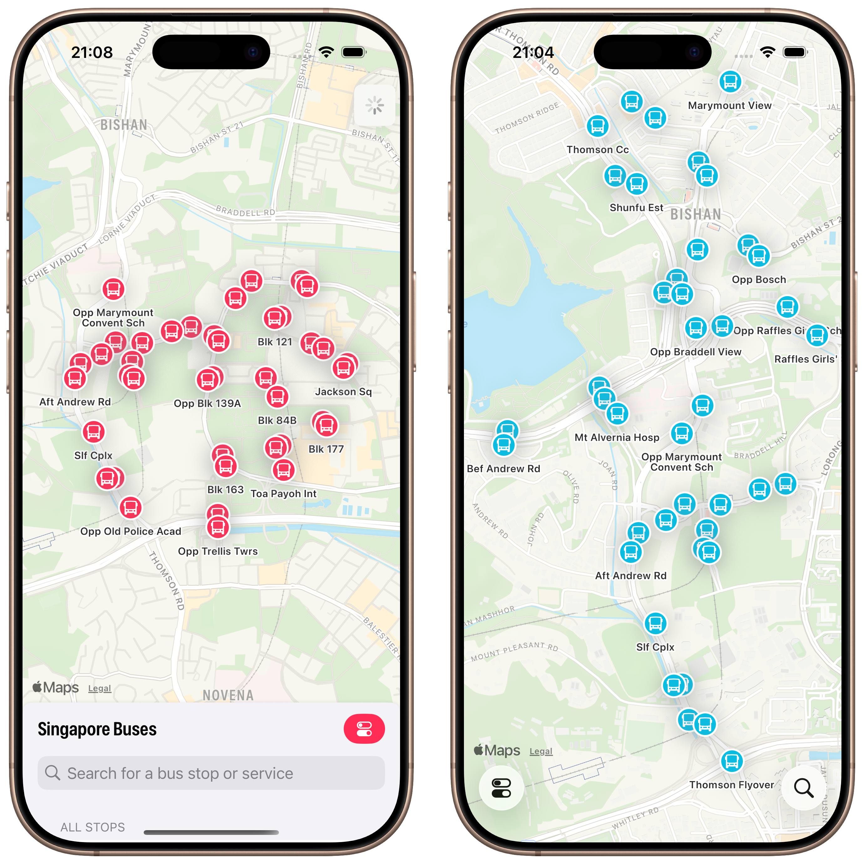
In the current version of Singapore Buses the Search view obscures between 10% to 95% of the map, depending on its detent. In addition to showing search results, the Search view also shows nearest bus stops, favourite bus stops, and provides access to the app’s settings.
For the upgrade to Liquid Glass, I’m adopting a toolbar to address these issues.
There are a few advantages to this approach.
First, there are more bus stops on the map and they update in real-time as you pan around the map1.
Second, although it’s not immediately apparent from the screenshot, the current version of Singapore Buses shows a janky animation when the Search view is moved to the medium detent—the map awkwardly re-centres itself during the transition. This is no longer a problem.
Third, Search only deals with bus stop search and favourites. Settings now lives on its own. It’s no longer sheet-on-top-of-sheet.
Modernising Search
Search itself has been cleaned up.
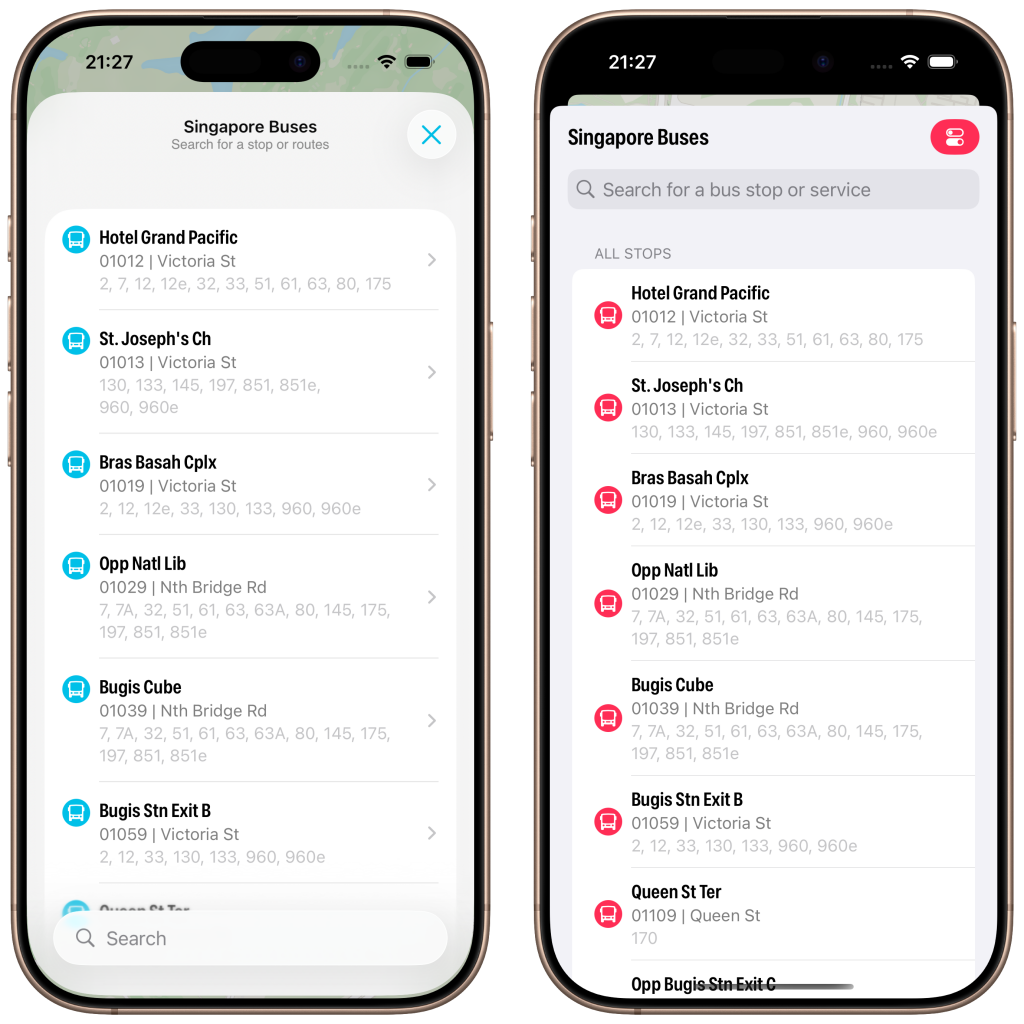
The search bar now appears at the bottom, the background is now using materials (ultra thin in light mode; ultra thick in dark mode). I’ve also changed the bus stop icon to align to the top and I’ve adopted navigation bar subtitles.
However, what really strikes me about the above screenshot is how much less content is available due to the larger cell margins. In iOS 26 you can see six bus stops vs. seven bus stops (plus the name of the eighth) on iOS 18. It’s not a complaint, I do prefer the look of iOS 26.
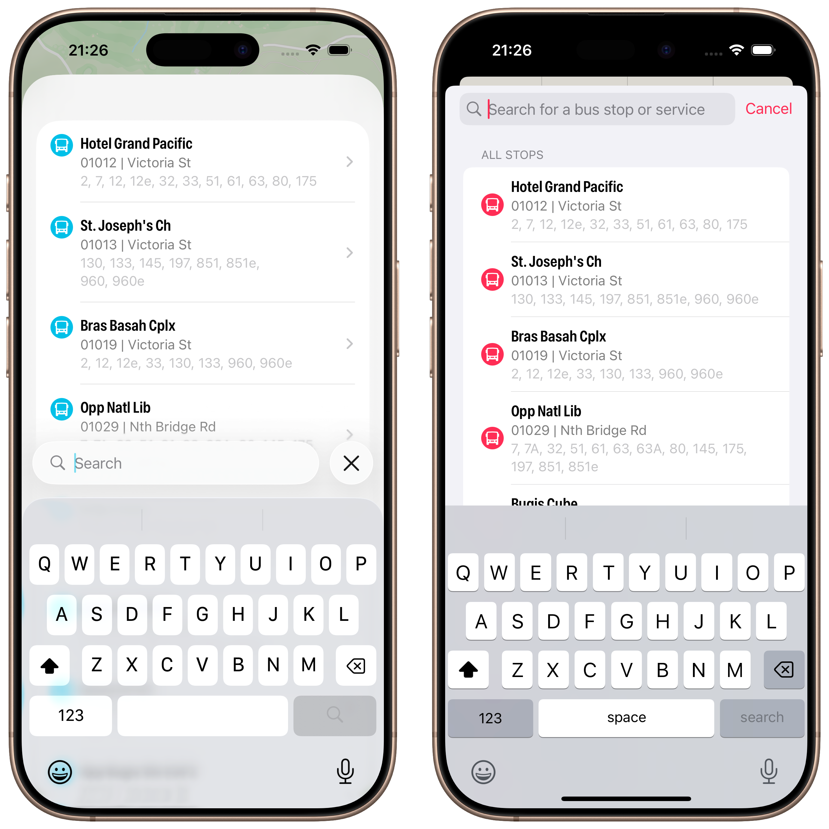
Lastly, a look at Search with the keyboard activated. No changes here made by me, but I do prefer the look of the translucent keyboard with the search bar sitting on top.
Abandoning Tab Bars
When I started writing this article last week I was well on my way to adopting a Tab Bar and not a Toolbar. After a few days of testing I was pulling my hair out:
- On my Map tab I was using a
tabViewBottomAccessoryto show the nearest bus stop to the user—to give them an easy way to tap and show arrival information. However, the accessory was available across all tabs where it made no sense (like Settings). Trying to hide the accessory (usingEmptyView) when the selected tab wasn’t the map worked, but navigating back to the map caused the map to stop extending into the safe area, resulting in a lovely white bar along the top.2 - Then there was the Search tab. It had a search bar that was fighting for space with other tabs, the tab bar accessory, and moving around based on scrolling actions. (Yes, you can control that to an extent, but is any of this tab bar behaviour a good idea in motion?)
So, the trusty toolbar has won out. Next up: redesigning Settings and Arrivals.
Redesigning the Arrivals view and Settings coming up next.
Discussion